
There's a sentence I've heard more times than I can count while working in UX:
“I think it’s obvious.”
And sometimes it is.
To us.
We've spent weeks talking about the product. We know why that button is there, what happens when you click it and where you're supposed to go next. We understand the terminology because we use it every day.
Then someone uses it for the first time and has absolutely no idea what to do.
That doesn't mean they're bad at using technology.
It probably means we've forgotten what it feels like not to know.
And that, really, is what UX is about.
UX stands for user experience, but you don't need to work in tech to have experienced it. If you've ever abandoned an online checkout because it was doing your head in, struggled to find something on a website or had to ask a colleague how to do something in a system you use every day — you've experienced bad UX.
Good UX is much less noticeable. You understand what to do, you do it and you carry on with your day.
Making that happen is where the work comes in.
“Well, I’d know what to do.”
This is one of the easiest traps to fall into when designing something.
You look at a screen and think:
I’d understand that.
Great.
You're not the user.
There's actually some psychology behind this. The false-consensus effect is our tendency to assume other people think and behave in similar ways to us.
It's completely human. It's also quite dangerous when you're designing something for other people.
- The designer isn't the user.
- The developer isn't the user.
- The client isn't the user.
- And the loudest person in the meeting definitely isn't automatically the user.
Our job is to look outside that room.
Your users don't know what you know
Another psychological phenomenon that appears constantly in UX is the curse of knowledge.
Once you know something, it becomes surprisingly difficult to imagine what it was like not to know it.
Spend long enough using the same software and it becomes second nature. Then a new starter joins and suddenly someone has to explain which menu they need, why they shouldn't click that button and why, despite its name, this section is actually where they need to go.
The useful question isn't:
Why don’t they understand it?
It's:
Why doesn’t this make sense without somebody explaining it?
- Maybe the language isn't clear.
- Maybe there are too many steps.
- Maybe the software has been built around an internal business process rather than the person actually trying to use it.
Sometimes the solution is tiny.
Sometimes you discover you've been solving the wrong problem entirely.
That's why the thinking matters.
We see what we want to see
Designers aren't immune to bias either.
If I've spent hours working through a problem and landed on a solution I really like, of course I want it to work.
That's human.
It's also where confirmation bias becomes relevant. We naturally pay more attention to information that supports what we already believe and can overlook information that challenges it.
Businesses can fall into the same trap.
Someone has an idea for a new feature. Everyone gets excited. Meetings happen. Requirements are written. Design starts. Development starts.
Then somebody eventually asks:
Do our customers actually need this?
Ideally, we'd like that question a little earlier.
That's part of the value of UX. It gives us space to question the solution before significant time and money is spent building it.
Who needs this? What problem does it solve? How could we make it easier?
And sometimes the slightly annoying one:
Do we need to build this at all?
Good UX requires being willing to be wrong. The important bit is finding that out early.
When everyone agrees, I get a little suspicious
Teams develop shared assumptions surprisingly quickly.
The same people attend the same meetings. They use the same terminology. They understand the same processes. Eventually, something can feel obvious simply because everyone in the room has been talking about it for months.
That's when simple questions become incredibly useful.
Why does it work like that?
Would a customer understand what that means?
Do they actually need this?
Sometimes there's a perfectly good answer.
Sometimes everyone goes quiet.
Those are usually the interesting ones.
UX isn't about being difficult for the sake of it. It's about challenging the assumptions that naturally develop when you're very close to a product.
Because "we all think this works" isn't the same thing as knowing it works.
Nobody uses software in perfect conditions
It's easy to forget, when you're analysing every detail of a screen, that real life is happening around the person using it.
They might be walking around a warehouse with a tablet, checking something on their phone with one hand and holding a coffee in the other, or trying to complete a task while someone talks at them from across the room.
They might be training a team while quietly panicking because they can't find the button they were about to show them, switching between four different systems, or attempting to remember a password they definitely reset last Tuesday.
They might have five minutes. They might have twenty seconds. They might get halfway through, be interrupted and come back ten minutes later with absolutely no idea what they were doing.
Meanwhile, we're debating whether the button should move four pixels to the left.
Your user doesn't care.
They just need the thing to work.
That's where cognitive load comes in. It sounds technical, but it's simple: there's a limit to how much information our brains can comfortably process at once.
Every unnecessary decision, unclear label or hidden action makes someone work a little harder. Across a system people use every day, those small bits of friction add up: more time, more mistakes, more support calls and more workarounds.
At that point, bad UX isn't just annoying.
It's costing the business time and money.
Bad UX doesn't always look bad
UX and visual design often get bundled together, but they're not the same thing.
A product can look fantastic and still be incredibly frustrating to use.
UX isn't just about making buttons prettier. It's about asking whether the button needs to be there in the first place.
- Can people find what they need?
- Do they understand what's being asked of them?
- Does the process make sense?
- Do they know what happens next?
Visual design matters.
But making the wrong process beautiful doesn't make it the right process.
Good UX is an exercise in getting over yourself
The best solution usually isn't the one that makes the designer look clever.
It's the one that makes the user's life easier.
Sometimes that means redesigning an interface. Sometimes it's removing things. Sometimes it's changing two words on a button.
And sometimes it's telling a team that the feature everyone has been discussing for the last month probably doesn't need to exist.
The job is to understand what people are actually trying to achieve, identify what's getting in their way and make that experience simpler.
That means listening, questioning, testing and being prepared to change your mind.
Start with people, then design the product
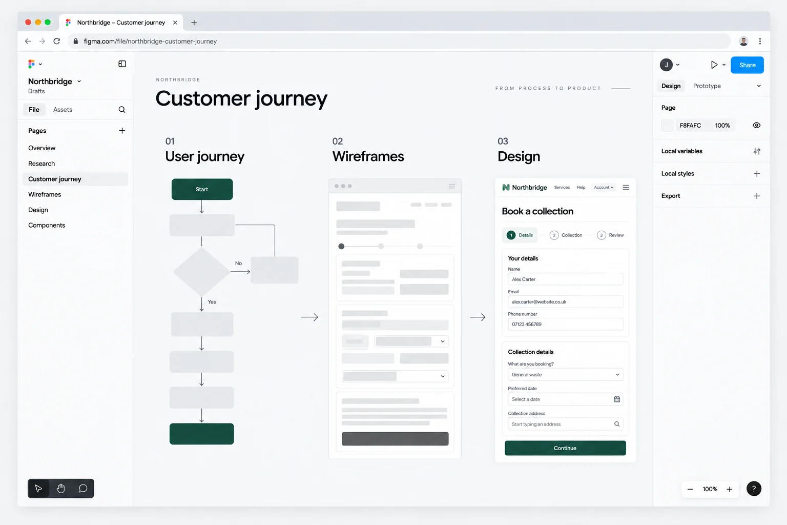
That's a big part of how we approach UX at 628.
Before worrying about polished screens, we want to understand what people are actually trying to do.
- Where are they getting stuck?
- What's taking longer than it should?
- What are they constantly asking for help with?
- And what does the business need from the system?
From there, we can simplify the process and test ideas before significant time and money is spent developing them.
Because ultimately, UX isn't really about screens.
It's about people.
And people are complicated, distracted, biased and very rarely behave exactly how we expect them to.
The people designing products are no different.
Which is why sometimes the biggest UX problem really might be the people in the room.