INDUSTRIAL ROOTS
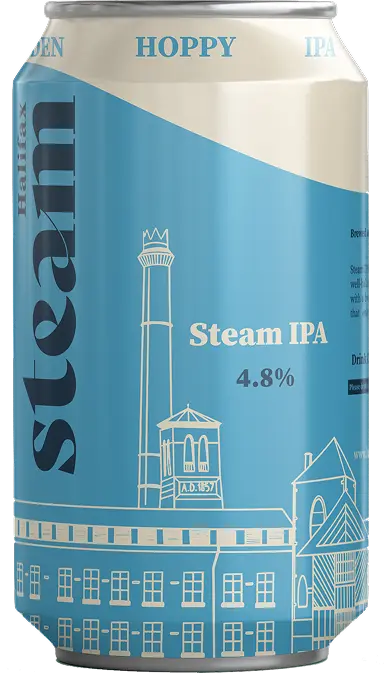
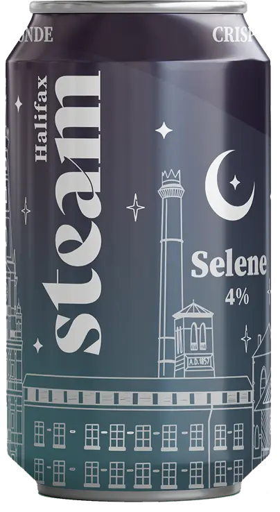
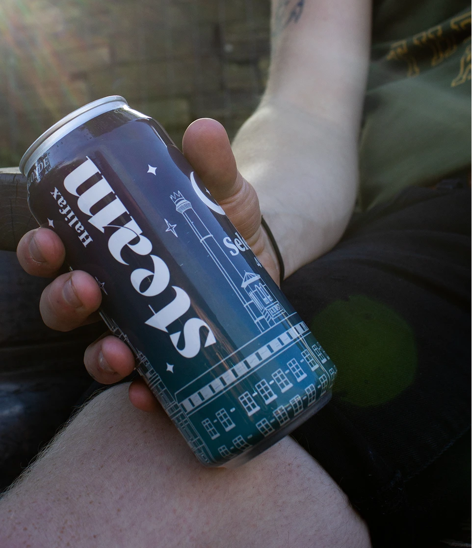
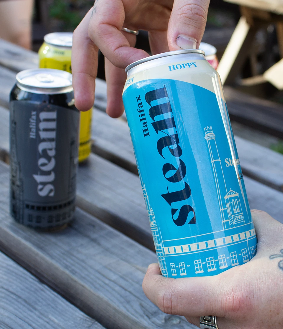
Industrial lines, architectural references and bold typograhpy
became the thread that ties the collection together.
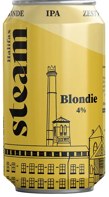
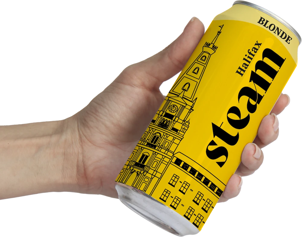
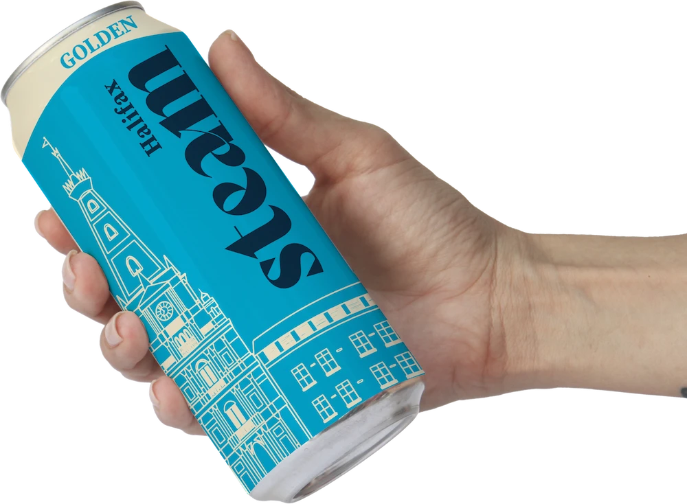
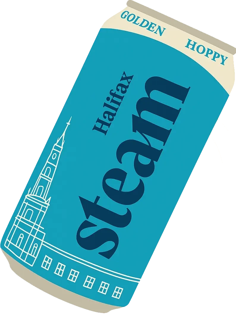
Halifax Steam needed packaging that celebrated its heritage while standing confidently in the craft beer space. The challenge was to create something that felt true to its history, but still fresh, bold and unmistakably local.
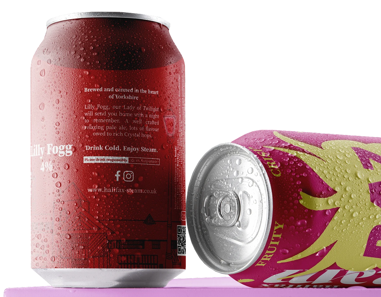
We designed a series of beer can labels, each one building on the brand's character while giving individual products their own identity. The result is a set of packaging that feels cohesive, recognisable and rooted in Halifax - while still holding its own on the shelf.
Product Design
Logo Design
Branding
Industrial lines, architectural references and bold typograhpy
became the thread that ties the collection together.


The brand feels cohesive, modern, and confident - a genuine reflection of the town’s creative spirit.